In a nutshell:
- A streetwear palette should consist of three to five colors to ensure brand coherence and versatility. Key, secondary, and accent colors are important, reflecting brand values and facilitating combinations. Sustainable brands favor muted earth tones and textures that are timeless and durable.
How many colors does a good streetwear palette need?
The answer is clear: 3 to 5 colors form the foundation of any consistent streetwear palette. More colors create visual chaos. Fewer often seem too restricted.
The proven structure is as follows:
- Main color: dominates the overall look, appears on most pieces
- Secondary color: complements and creates depth, for example, for trousers or hoodies
- Accent color(s): one to two targeted splashes of color for logos, details, or accessories
Combining too many colors dilutes the brand identity. Especially for sustainable labels: a clear palette makes pieces combinable for a long time and reduces the need for new purchases. The contrast within the palette also matters. Color pairs with low contrast impair the readability of designs and should be avoided.
What colors say about your streetwear brand
Color psychology is not a trend. It is a tool that makes brand values visible without needing a single word.
- Black: stands for strength, authority, and professionalism. No wonder it has become a basic color in streetwear.
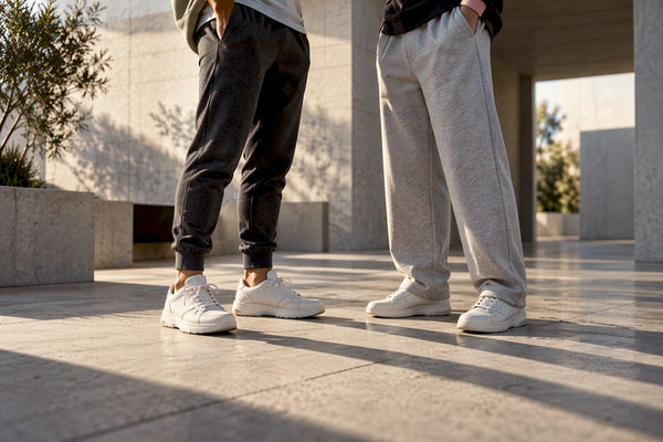
- Grey: appears relaxed and cool, without being intrusive. Ideal as a secondary color for urban looks.
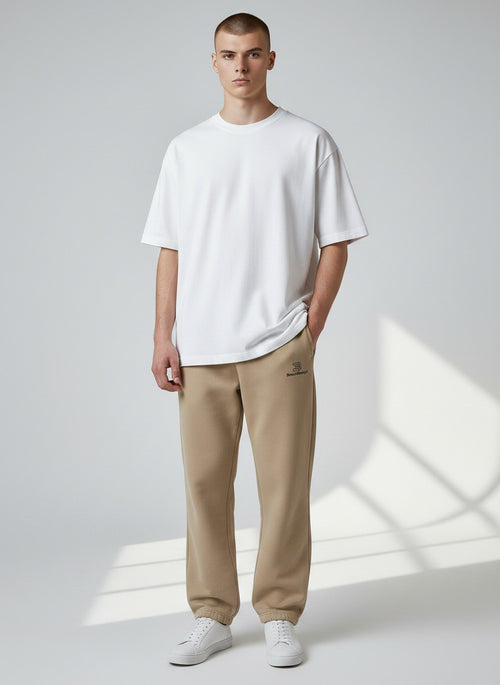
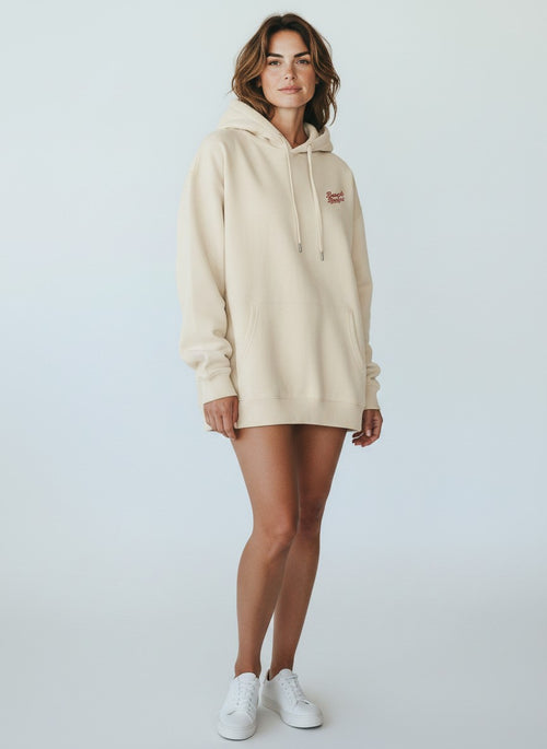
- Cream and Off-White: communicate “Quiet Luxury,” i.e., understated elegance. Particularly popular in minimalist collections.
- Olive tones: represent authenticity and earthiness. They go well with sustainable brands because they are visually associated with nature.
- Strong colors like neon green or signal red: generate energy and youthfulness. Good as an accent color, but rarely wearable as a main color.
The choice of color should be directly derived from the brand identity. A brand that emphasizes sustainability will tend to use muted earth tones rather than bright neon colors. Those who want to communicate energy and rebellion choose high-contrast combinations. Both are legitimate, as long as the palette remains internally consistent.
Styling monochrome outfits correctly: Here's how it works
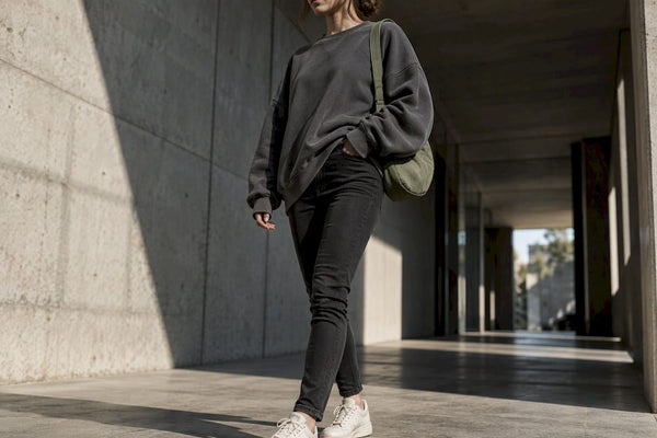
Monochrome outfits are considered one of the easiest ways to achieve a modern, expensive-looking style. The principle: all pieces of an outfit in the same color or in tonal gradations thereof.
- Start with a coordinated set and add matching accessories.
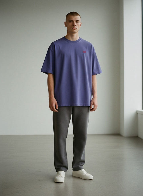
- Tonal gradations such as plum, burgundy, and wine red within a color family appear more thought-out than a single shade from head to toe.
- Add a targeted color accent with an accessory or a jacket to refresh the look without having to buy new clothes.
- Mix textures: leather, knit, and cotton in the same color create depth and prevent the look from appearing flat.
Pro Tip: Tonal outfits work best when all tones are either warm or cool. A warm accent against a cool base tone creates subtle tension that makes the look more interesting.
Those who want to try color blocking opt for so-called sister colors: colors that are adjacent on the color wheel. Red and pink, green and petrol, or taupe and beige are classic pairs. They combine the depth of tonal styling with the vibrancy of color blocking.

How Beachbodyz combines color palette and sustainability
Beachbodyz shows how a sustainable streetwear brand integrates color choice and material strategy. The brand focuses on muted sage and charcoal tones that appear timeless and can be combined across seasons.
- Material choice influences color effect: GOTS-certified organic cotton and recycled polyester absorb color differently than synthetic fibers. Muted tones appear deeper and more matte on natural fibers, which suits the Beachbodyz brand image.
- Seasonal adaptation without a restart: Instead of introducing a new palette every season, Beachbodyz complements existing basic colors with individual accent tones in limited drops. This conserves resources and strengthens brand recognition.
- Integrating color trends without dependence: Current streetwear color trends are incorporated as accent colors, never as the main color. This keeps the collection contemporary without appearing outdated in two years.
- Texture as a color enhancer: Oversized cuts in heavy 320-gram fleece appear different in dark gray than the same gray on a light jersey. Beachbodyz specifically uses this effect.
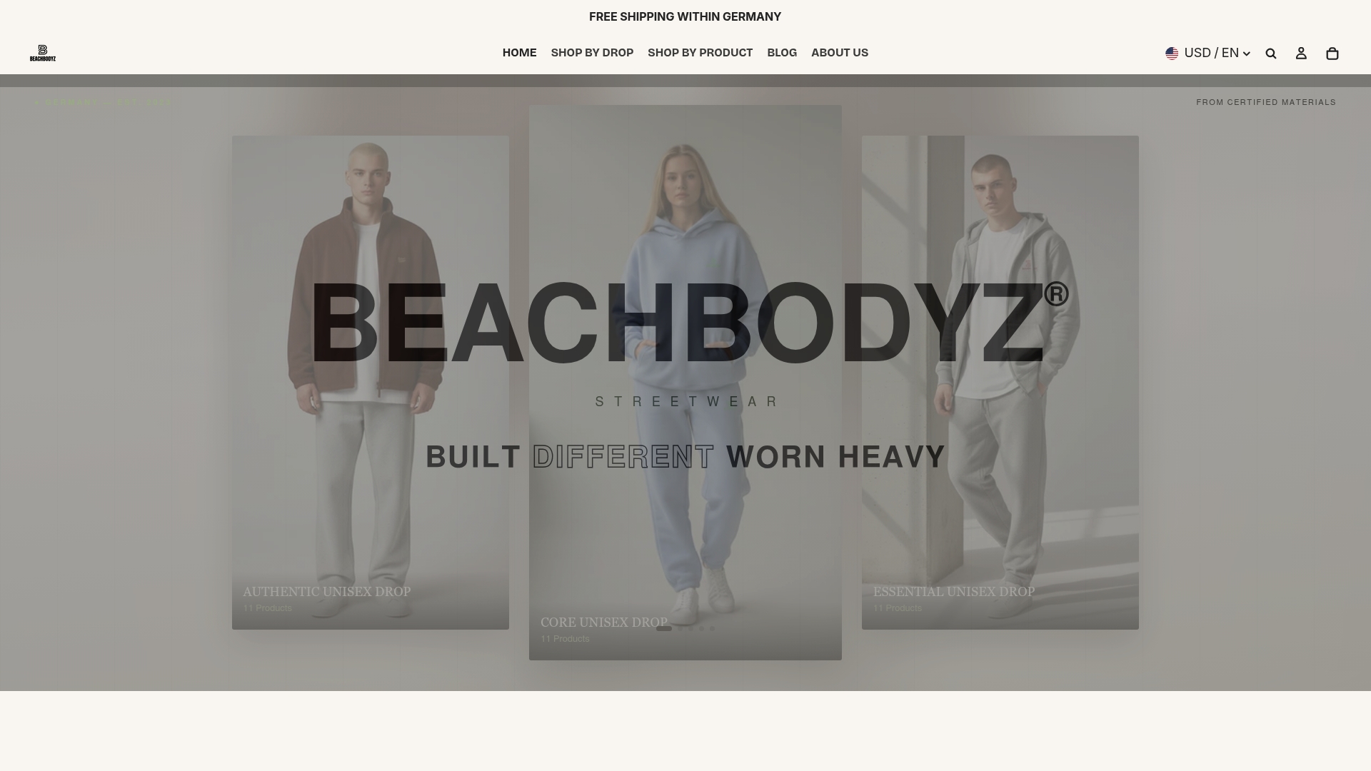
Those looking for sustainable streetwear with a well-thought-out color palette will find concrete examples at Beachbodyz: The Authentic Sport Jogginghose shows how muted tones on high-quality natural fibers work and fit into existing color palettes.
Key takeaways
A streetwear palette of 3 to 5 colors with a clear main, secondary, and accent structure creates consistency, facilitates combining, and strengthens brand identity in the long term.
| Topic | Details |
|---|---|
| Ideal number of colors | 3 to 5 colors form a consistent, easily combinable palette. |
| Utilize color psychology | Black, grey, cream, and olive tones each communicate specific brand values. |
| Enhance monochrome looks | Tonal gradations and texture mix create depth without new clothing. |
| Plan for sustainability | Muted earth tones on natural fibers appear timeless and trend-resistant. |
| Consider contrast | Low-contrast color pairs impair the readability of designs. |
Why sustainable color palettes are the better choice in streetwear
Many streetwear enthusiasts underestimate how strongly the color palette influences purchasing behavior. Those who choose a palette of muted, timeless tones buy less often because the pieces can be combined for years. This is no coincidence, but strategy.
Beachbodyz makes this visible: The combination of GOTS-certified materials and a coherent color palette results in clothing that doesn't disappear from the wardrobe after one season. Muted tones on organic cotton age better than bright colors on synthetic fibers. And a brand that consistently maintains its palette builds recognition without constantly having to produce new designs.
The real mistake is not in the wrong color, but in the lack of a system. Those who combine colors without a main-secondary-accent structure end up with a look that appears random. Color palettes are not a style element for advanced users. They are the foundation.
FAQ
How many colors should a streetwear palette have?
3 to 5 colors are considered ideal. A main color, a secondary color, and one to two accent colors create a consistent, professional appearance.
Which colors are best suited for sustainable streetwear design?
Muted earth tones such as olive green, charcoal, cream, and gray appear timeless and harmonize well with natural fibers like organic cotton.
How do monochrome outfits work in streetwear?
Monochrome outfits are created by tonal gradations of one color combined with a mix of textures. Leather, knit, and cotton in the same color create depth and prevent a flat look.
What is the most common mistake with color palettes?
Combining too many colors at once dilutes the brand identity. Low contrast between colors also impairs the readability of designs.
How do I incorporate current color trends without overloading the palette?
Trends are best incorporated as accent colors in limited collections, not as the main color. This keeps the palette contemporary without appearing outdated after one season.